
Whispered Elegance in Neutrals and Monochrome
Decoding Quiet Luxury Without Saying a Word
The Psychology of Calm Tones
Neutrals reduce visual noise, helping the brain rest, focus, and recover. Soft value transitions lower cognitive load while still guiding the eye. Desaturated palettes communicate competence and trust, especially when balanced with natural materials. This effect is magnified by mindful lighting, generous breathing room, and tactile layers that invite slow appreciation of detail instead of constant visual stimulation.
How Monochrome Achieves Depth
Monochrome designs build richness through value steps, texture contrast, and material interplay rather than hue variation. Layers of matte, open-weave fabric, honed stone, and brushed metal create dimensionality. Strategic highlights and shadows add rhythm, while deliberate repetition protects coherence. With thoughtful composition, a single color family can feel both expansive and intimate, transforming simplicity into a nuanced, living narrative.
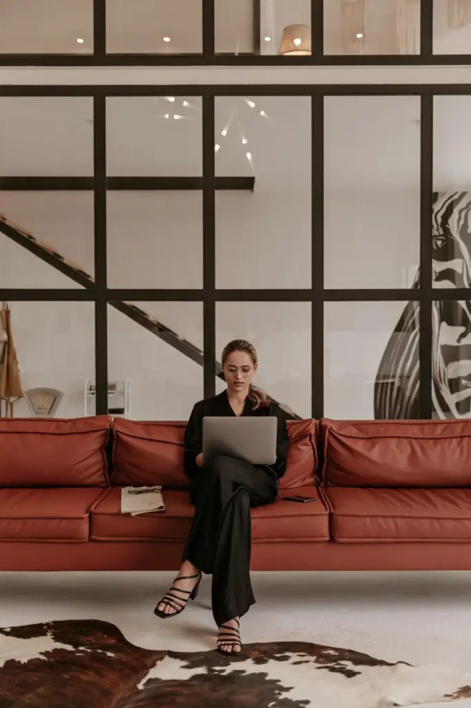
Signals of Quality Beyond Logos
In quiet luxury, the proof is in the making: consistent stitch density, aligned grain, precise seams, hand-finished edges, and authentic materials with honest patina. Neutrals and monochrome palettes reveal these details clearly. There is nowhere to hide, so craftsmanship becomes the focal point, letting quality whisper convincingly through texture, proportion, and performance across time and everyday use.
Warm and Cool in Delicate Balance

Undertones Under Control

Testing Paint and Fabric in Real Light

Texture, Materiality, and the Art of Subtle Contrast
Matte, Satin, and Gloss in Harmony
Use matte walls as a calming canvas, satin textiles for gentle sheen, and small gloss moments to spark interest. Think lacquered tray on a chalky console, or polished brass against wool. Shift reflectance gradually to avoid glare. This hierarchy of finish directs the eye while preserving the hush that defines sophisticated, uncluttered, and enduring environments.
Natural Fibers and Stone Tell the Story
Linen, wool, cotton, and silk carry breathability, depth, and shade variability that synthetics rarely match. Limestone, travertine, and soapstone offer mineral warmth and organic variation. Together, these materials build narratives that grow more beautiful with use. Their quiet imperfections provide character, allowing neutral and monochrome palettes to feel alive, grounded, and generously tactile rather than sterile.
Lighting That Carves Silhouettes
Layer ambient, task, and accent lighting to model shapes and reveal textures. Warm dimming LEDs echo candlelight for evening softness, while directional fixtures graze stone to enhance relief. Avoid uniform brightness, which flattens subtle contrasts. With carefully aimed light, monochrome palettes unfold new tonal notes across the day, reinforcing calm, rhythm, and intimacy without artificial drama.
Room-by-Room Monochrome Guides
A Serene Living Room Layering Plan
Anchor with a mid-tone rug and softer sofa silhouette, then build tonal pillows in linen and velvet. Introduce a single dark wood piece for depth and a low, rounded coffee table for warmth. Sheers diffuse daylight, while art in graphite lines adds soul. The result encourages conversation without distraction, comfortable for gatherings and deeply restful when alone.
Restful Bedroom in Gentle Values
Choose a headboard with tactile upholstery and crisp percale sheets in slightly cooler whites. Layer a textured throw and a darker bedside table for grounded contrast. Keep hardware refined and quiet. Reading sconces with dimming preserve evening softness, promoting restoration. The monochrome approach keeps mornings bright, evenings calm, and transitions between day and night beautifully fluid.
Spa Calm in Stone and Steam
Honed limestone or porcelain lookalikes set a serene base. Use minimal grout contrasts for continuity. Soft cotton towels, brushed nickel fixtures, and frosted glass complete the feel. Store essentials in closed cabinetry to protect visual stillness. Diffused lighting and a slightly warmer white balance invite comfort, delivering a spa-like atmosphere that supports daily rituals with soothing regularity.
Wardrobes That Whisper Luxury
A Capsule in One Color Family
Build around charcoal, ivory, or warm taupe, then vary textures and weights. A tailored blazer, fluid trousers, crisp tee, and soft knit intermix effortlessly. Footwear in the same family extends legs visually. Limiting hue variation reduces friction, ensuring each morning feels intentional, polished, and quietly expressive without the churn of trend-driven replacements or visual clutter.
Fabric Hand, Drape, and Structure
The way fabric falls reveals quality instantly. Dense knits hold shape; high-twist wool resists wrinkles; silk crêpe moves like breath. In neutrals, these qualities shine. Prioritize comfort and longevity over logos, focusing on seams, lining, and finishing. The result is presence with ease, a wardrobe that reads refined from across the room and even better up close.
Accessories as Subtle Accents
Think brushed metals, understated leather belts, and sculptural yet quiet jewelry. One exceptional piece can replace many average ones. Keep color aligned with your base palette for coherence. Texture becomes your signature: pebbled leather loafers, a suede clutch, or a woven strap. Each small decision contributes to a cohesive, timeless, and polished personal aesthetic.
Branding, Photography, and Interfaces in Gray and Cream
Practical Palettes, Swatches, and Care
All Rights Reserved.